
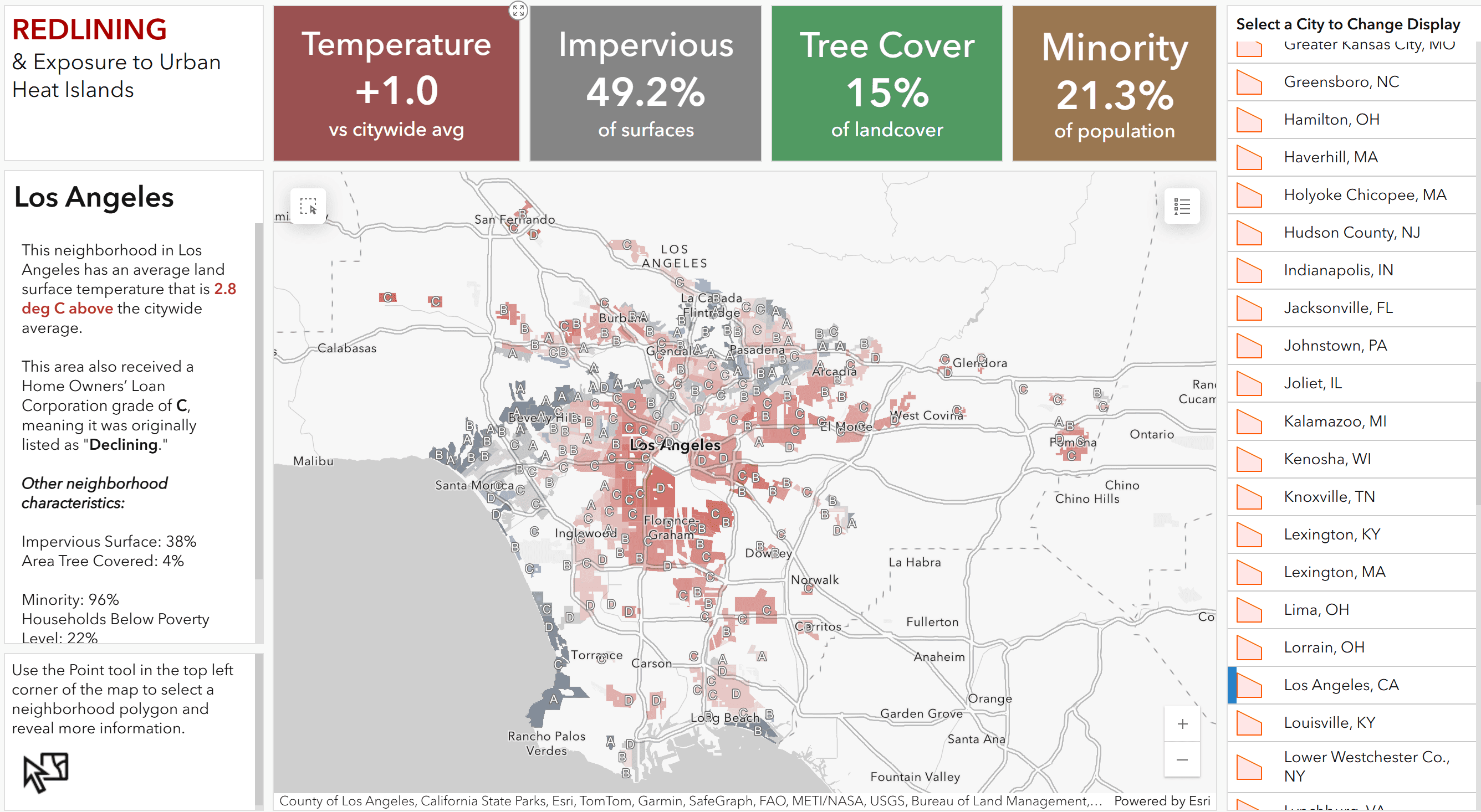
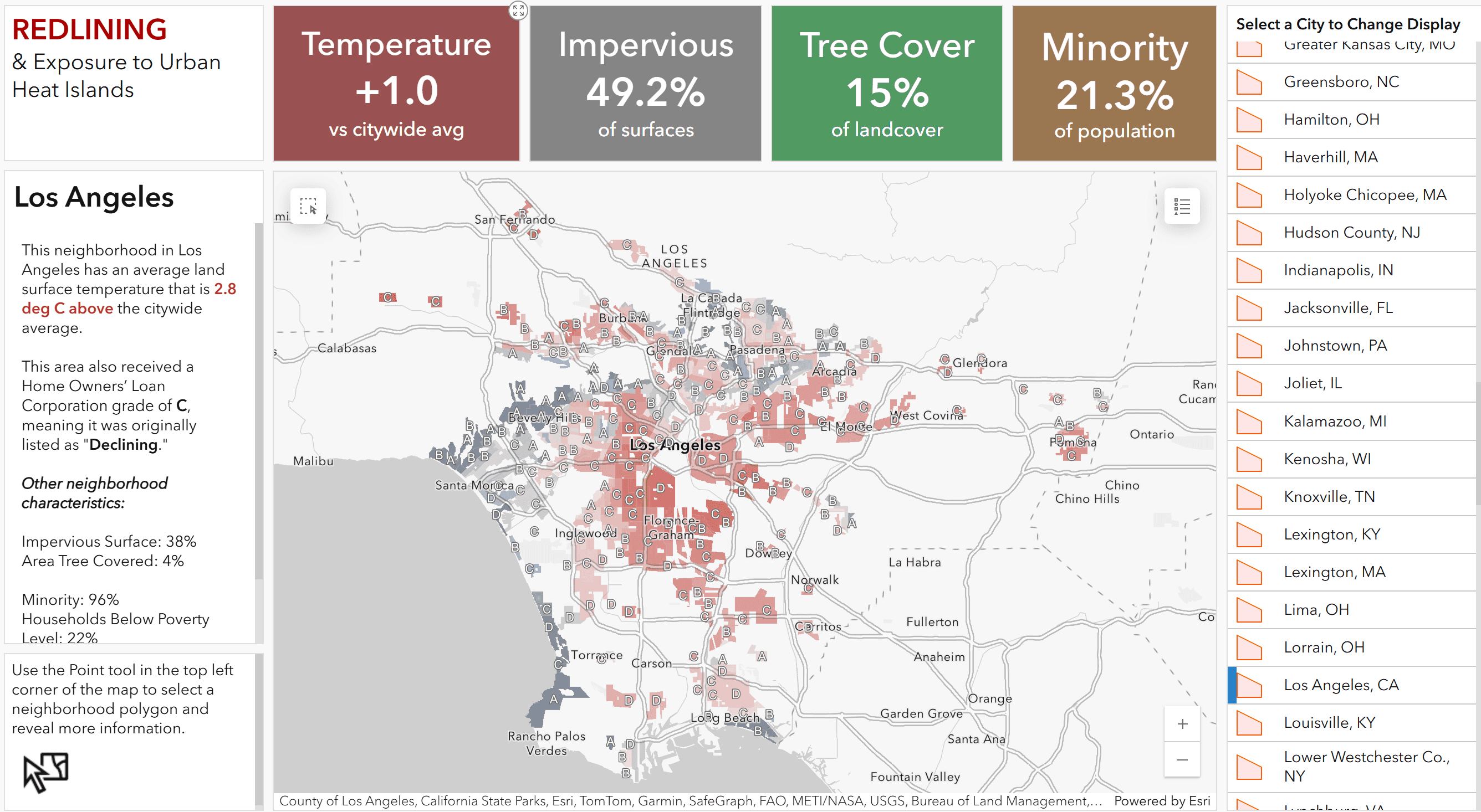
Redlining and Urban Heat Dashboard.
https://www.arcgis.com/apps/dashboards/73e329457b6644e7aeff13ecce43c8d8
About the resource
This Dashboard presents results from Hoffman et al. (2020) which showed that formerly "redlined" neighborhoods are predominantly warmer today than their non-redlined neighbors in 94% of the cities studied.








Members
Sign in to continue
Sign in to download this file. It's free to register, and we will bring you straight back to this page.
Or continue with email
No account? Register